









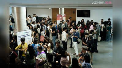
“Those are too many dots,” said a designer in the audience, looking at a chart showing data centres plotted on a world map. Prakriti Bakshi, an independent journalist conducting the workshop, didn’t flinch. “That’s just how crowded data centres are there.” Two people. One chart. Two entirely legitimate perspectives — and no clean way to resolve them. This exchange captured the productive friction at VizChitra 2026, the second edition of India’s first community-driven data visualisation conference, held at the Bangalore International Centre (BIC) last weekend. Across workshops and talks, journalists, designers, engineers, and researchers discussed the tension between accuracy and aesthetics, between the story you want to tell and the data you actually have. VizChitra was definitely not your typical data conference. Out in the corridor, terms like ‘Martini Glass’ and ‘Double Pyramid’ drifted through conversations — terms that sound cryptic unless you worked in data visualisation. A Martini Glass describes the structure of an interactive data story; a Double Pyramid is a conceptual framework from data journalism. Neither term would mean much outside this room. Inside it, they need no explanation. In another room, Adolfo Arranz, senior graphics editor at Reuters, asked attendees to sketch their own hands without looking at the paper, then to find the negative spaces in an inverted image of an elephant. “This activates your left brain,” he says, moving through slides that show how years of sketching practice have quietly shaped the way he builds data stories. Around him, people who spend most of their working hours in front of screens are bent over paper instead, with pencils moving slowly. Activities involving pen-and-paper first-cuts of charts were a recurring theme, as were the harder questions that followed: What makes a chart forgettable? What makes it misleading? What makes it lie without technically being wrong? Outside the venue, a group from the ‘Observe, Collect, Map: A Sensory Data Walkshop’ was on the street, moving slowly and stopping to take in the surroundings. Onlookers watched them studying something ordinary as if it were extraordinary! Which was more or less exactly what they were doing. Day two began differently. Before the first talk, the auditorium filled with a yawn, a sigh, and then — unexpectedly — choral singing. Paltas and Alankaras, with a tanpura playing at C-Sharp in the background. This was at the behest of Nikita Deshpande, an art and animation director and illustrator, whose ‘morning melody’ session set the tone for a half-day of talks, lectures, and dialogues on everything data. The same room clapped and danced to Ashok Kumar’s djembe beats during the ‘afternoon rhythm’. Deshpande and Kumar punctuated what was otherwise a full day of data. Meeting Ground VizChitra was launched in June 2025 with a simple premise: there was no common meeting ground for India’s data visualisation community. Designers were in one world, statisticians in another, journalists and researchers somewhere else entirely. That first conference drew over 300 attendees. Co-organiser Gurman Bhatia recalls that the feedback afterwards was some version of the same thing: they had met someone from a completely different field wrestling with exactly the same problems. Such intersections were visible in every session this year, too. A designer wrestling with a messy dataset found herself next to a data scientist who could make a chart look clean. A storyteller with a strong narrative instinct ran into a developer who could build the interactive piece she had imagined. The organisers’ bet — that a conference built for everyone rather than one discipline would complete, rather than dilute, the room — appeared to be paying off. More Than Charts Data visualisation sits at an odd crossroads: part design, part statistics, part journalism, part engineering. The session mix at VizChitra reflected that deliberately. “We tried to cater to mixed skill levels. Some sessions are quite advanced. Others are designed to be welcoming to someone who has never thought formally about data visualisation before,” co-organiser Amit Kapoor said. On one end, attendees sketched chart ideas. On the other, they built agentic AI tools that generate interactive graphics from scratch. And then there were people who totally hated charts. The audience mix was borne out by numbers: Designers made up roughly a third of the 600 attendees, journalists accounted for 12% and 9% were developers and engineers. Enterprise practitioners and solo freelancers shared rows, the big-company and indie worlds in a room that, until recently, neither knew the other occupied. A govt data scientist from the Ministry of Statistics and Programme Implementation (MoSPI) spoke about visualising public data at the scale of 1.4 billion people. On the same programme was an MIT CSAIL professor, one of the original creators of the Vega visualisation grammar, exploring what comes after grammar-based charting. MoSPI additional director general Rohit Bharadwaj put it aptly: “Initially, I wondered if I was relevant here. But I must give it to the organisers for seeing what I couldn’t: There’s always room for a plumber in a conference of architects! The plumber’s work ensures that the pipe behind the walls isn’t leaking so that beautiful houses can be built. And that’s our job as statisticians to ensure that data pipelines are available to designers, journalists, researchers and others without leakage so that they can work on creating beautiful work.” Volunteers And Support This year’s edition drew over 150 submissions — up sharply from 2025 — and several workshops sold out well before the doors opened. The room fills itself now. What sustains it is harder to see. Funding comes roughly 60% from ticket sales and 40% from sponsorships. “Money is always a challenge. But what’s harder is sustaining volunteer effort over months,” Kapoor said. Between 25 and 30 people gave time across many months to make VizChitra happen. None of them was paid. Bengaluru wasn’t an accidental choice. “Conference culture — people actually paying for tickets — is stronger here than in most other Indian cities… That matters when you are trying to keep something like this financially viable,” Bhatia said. A Seat At The Table Perhaps the most deliberate thinking at VizChitra goes into who is in the room at all. The organisers used a framework they call SOLID: Socioeconomic background, Opportunity (the networks and access people are born into), Location, Identity, and Domain (journalism, research, BI, design, toolmakers, academia and more). It is an unusually structured way to think about a problem most events wave at vaguely. “I’ve never been a numbers person, but through Project Nilay I realised I couldn’t ignore data because there’s so little information on what happens to children after they leave orphanages at 18. VizChitra showed me that data doesn’t have to be intimidating. Good visualisation can tell the children’s stories in a way that’s rooted in evidence without reducing them to numbers,” said Prachi Mishra, founder, Project Nilay, which supports young people transitioning out of childcare institutions. A scholarship made it possible for her to attend. Community Takes Shape The people in the rooms weren’t just interested in making charts look better. Several of the most-discussed sessions sat at the edge of visualisation and public accountability — a redesign of BMTC’s Majestic bus station maps built with Bengaluru Metropolitan Transport Corporation (BMTC), a UN Women Asia-Pacific statistician’s account of getting bureaucrats to be honest about data, one CTO’s attempt to make health insurance costs legible to ordinary people. The exhibition track went further: installations on vanishing insect populations, extinction timelines, the water embedded invisibly in food, using data art to make slow-moving crises feel immediate. Whether VizChitra becomes a durable institution or remains a once-a-year reunion may depend less on ticket sales than on whether the connections made here — designer to statistician, journalist to developer — outlast the weekend. As the crowd thinned on the second evening, leftover coffee cups sat beside open laptops. The charts were still on the screens. Nobody seemed in a hurry to close them.